TENDECIAS DEL DISEÑO 2024 : GRADIENT [ESP-ENG]
11
About :

DESIGN
¡Saludos a la comunidad!
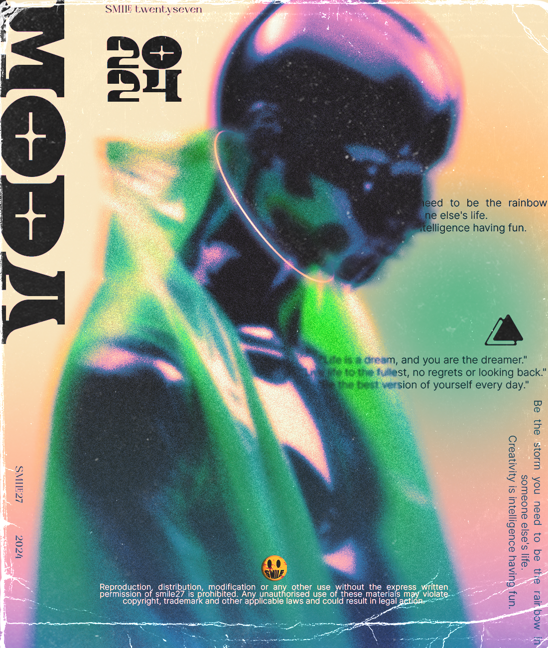
En esta ocasión, les presento un tutorial sobre cómo crear una portada de revista siguiendo la última tendencia en diseño gráfico, que destaca el uso de degradados. Este 2024 nos trae esta nueva moda, donde ya no es necesario limitarse a una paleta de colores complementarios; ahora, la clave está en combinar colores de manera conjunta. Es importante señalar que en el video se emplearon técnicas básicas de Photoshop para acercarles el uso de esta herramienta.
Dicho esto, pasemos al proceso. Les explicaré el uso de herramientas y mucho más.
Greetings community! This time, I bring you a tutorial on how to create a magazine cover following the latest trend in graphic design, which emphasizes the use of gradients. In 2024, this trend has emerged, where it's no longer necessary to stick to a complementary color palette; now, the key is to combine colors in a cohesive manner. It's worth noting that in the video, basic Photoshop techniques were used to bring you closer to the use of this tool.
With that said, let's move on to the process. I'll explain the use of tools and more.
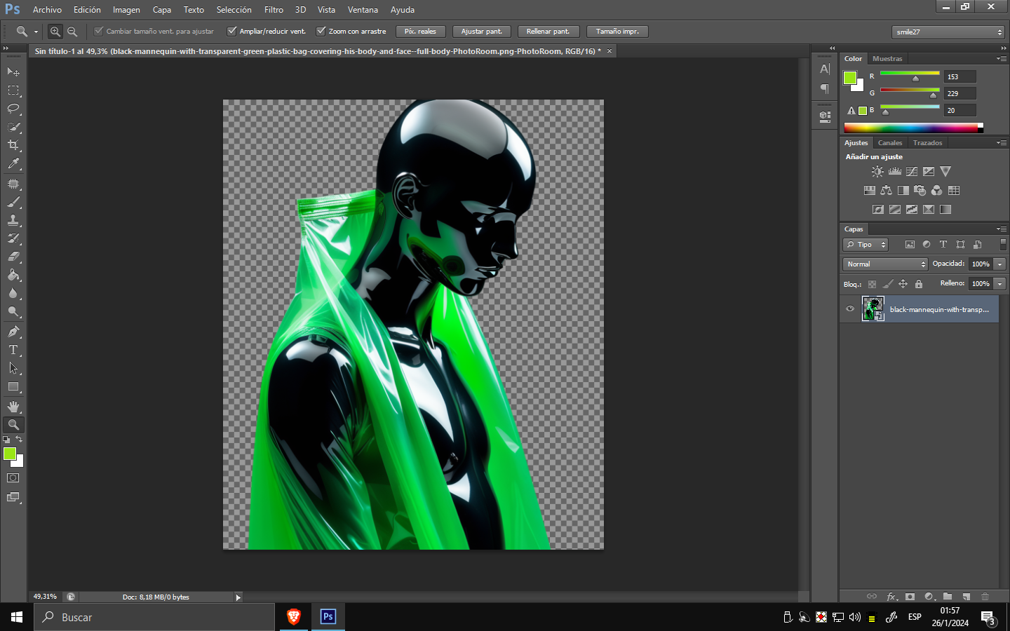
Las dimensiones serán de 1100 de ancho por 1300 de altura.
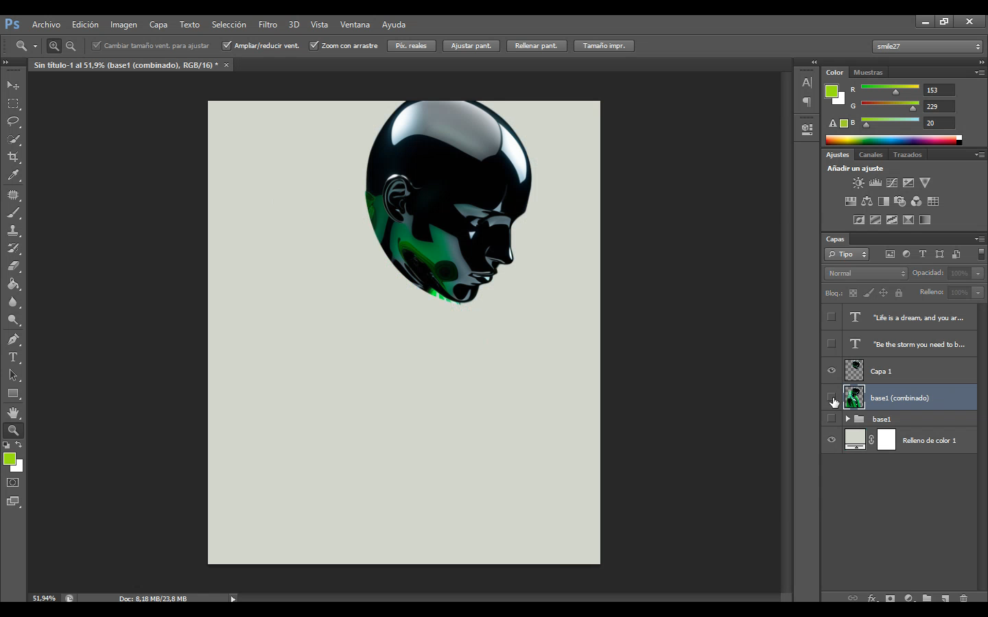
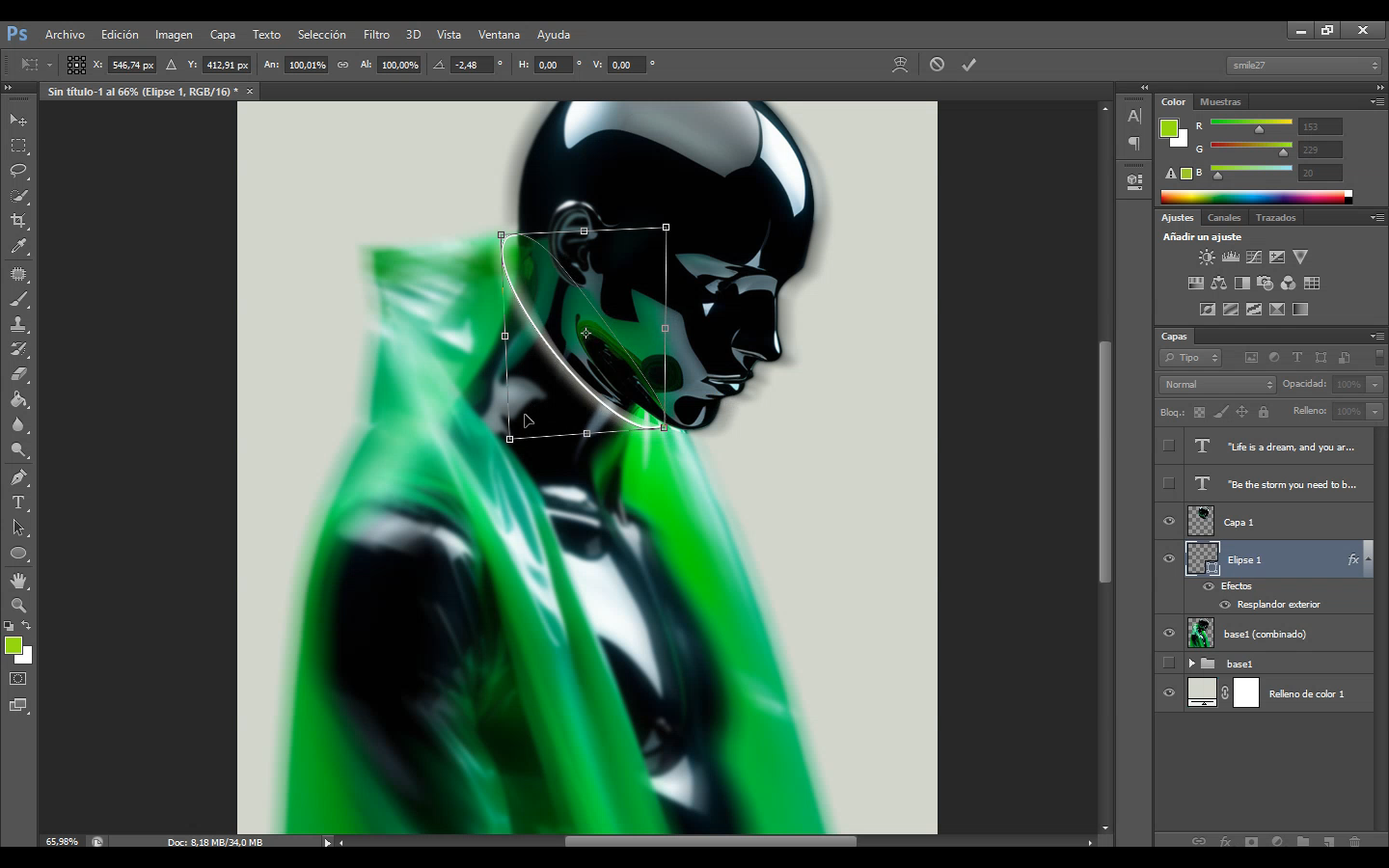
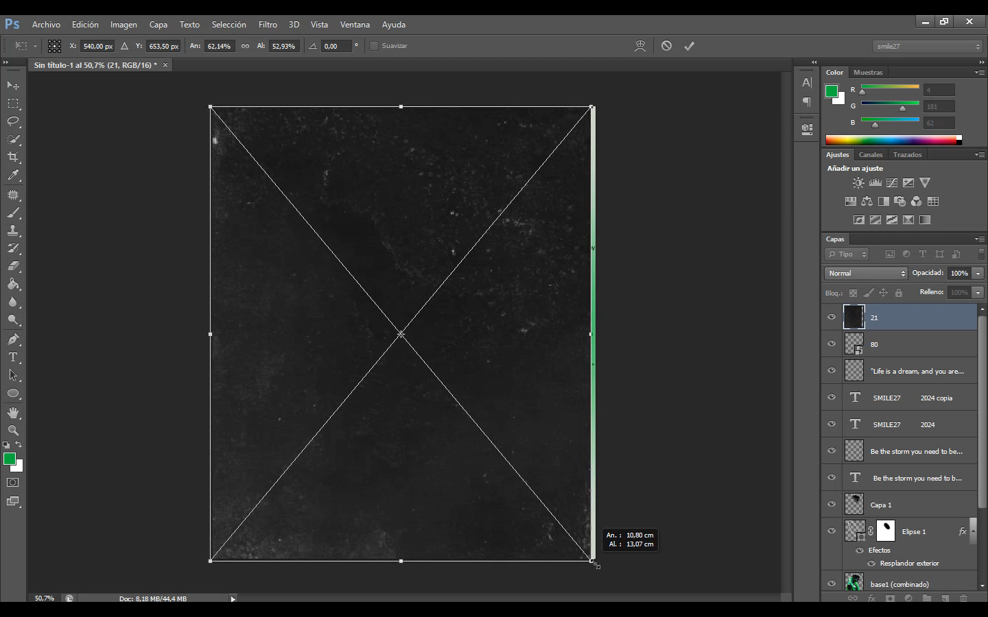
Una vez colocado el objeto principal, procedemos a realizar un recorte en la parte de su cabeza utilizando la herramienta LAZO. Después de seleccionar la zona, presionamos Ctrl + J para copiar la cabeza en una nueva capa. Luego, seleccionamos la capa inferior (la que está debajo de la cabeza) y nos dirigimos a Filtros > Desenfocar > Gaussiano, ajustando según nuestras preferencias.
¿Por qué realizo esta acción?
Mi intención en el diseño de la portada es crear como un "portal pequeño" entre el círculo y la cabeza del maniquí. Para ser más preciso, como si estuviera atravesándolo gradualmente.
The dimensions will be 1100 in width by 1300 in height. Once the main object is placed, we proceed to make a cut in the part of its head using the LASSO tool. After selecting the area, we press Ctrl + J to copy the head to a new layer. Then, we select the lower layer (the one beneath the head) and go to Filters > Blur > Gaussian Blur, adjusting to our liking.
Why do I perform this action?
My intention in designing the cover is to create a kind of "small portal" between the circle and the mannequin's head. To be more precise, it looks as if it is gradually passing through.
Creamos un círculo utilizando la herramienta de forma (presionando U) y ajustamos la perspectiva del círculo creado desde sus bordes. Presionando Ctrl, acomodamos la perspectiva.
We create a circle using the Shape tool (pressing U) and adjust the perspective of the created circle from its edges. By pressing Ctrl, we modify the perspective.
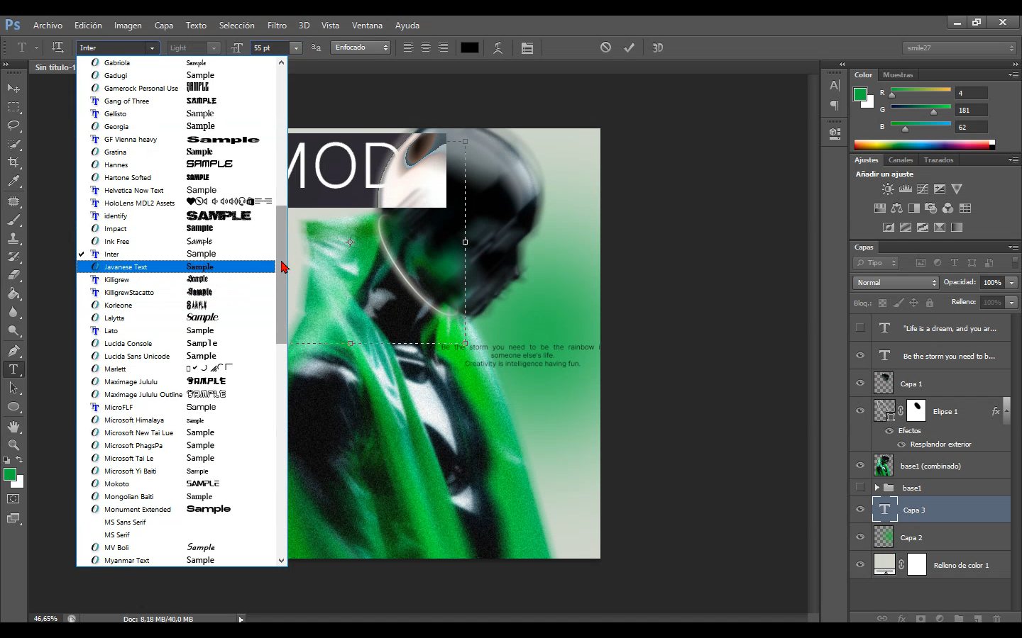
Para el título, optamos por algo que rompa con el estereotipo elegante, aprovechando la nueva tendencia como el brutalismo y el maximalismo que desafían los conceptos tradicionales del diseño. También podemos incorporar expresiones o dichos para darle un toque personal al título.
Aplicamos el uso de texturas que complementarán el diseño final, y el ruido que agregamos a las capas también es esencial para evitar un diseño demasiado sólido.
For the title, we choose something that breaks away from the elegant stereotype, embracing the new trend of brutalism and maximalism that challenge traditional design concepts. We can also incorporate expressions or sayings to add a personal touch to the title.
We apply the use of textures that will complement the final design, and the noise added to the layers is also crucial to avoid a overly solid design.
GRADIENT
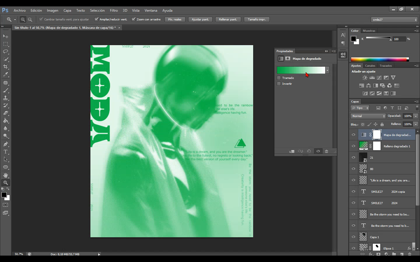
Ahora nos dirigimos al concepto. Una vez agregada la capa de "mapa de degradado", que toma las luces y sombras y las convierte en la selección que hagas del degradado. Como se puede observar, seleccioné una saturación y, para algunos, el concepto de destrucción o la combinación puede ser totalmente a gusto.
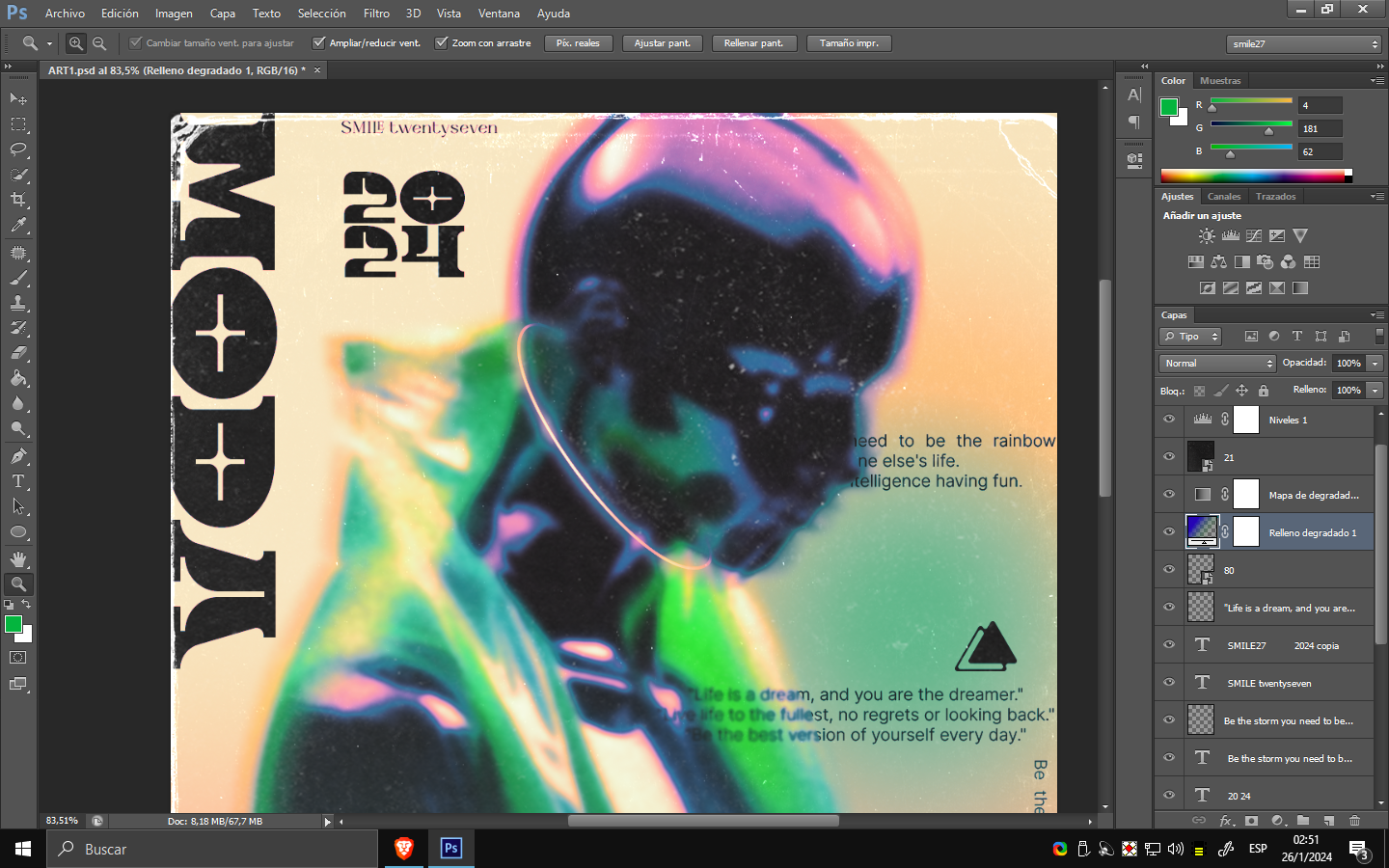
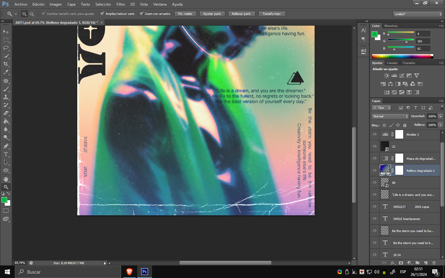
Después de colocar el degradado, procedemos a ubicarlo en el modo de fusión "superponer" para que los colores sean absorbidos de manera más efectiva. Luego, con respecto a los textos dispersos, los utilizamos como relleno para el resto del diseño, rompiendo un esquema del diseño para que el espectador pueda notar los objetos que rodean la portada.
Now, let's move on to the concept. Once the "gradient map" layer is added, which takes lights and shadows and turns them into the selection you make from the gradient, as seen, I selected a saturation, and for some, the concept of destruction or combination can be entirely to taste.
After placing the gradient, we proceed to set it to the "overlay" blending mode so that the colors are better absorbed. Moving on to the scattered texts, we use them as fillers for the rest of the design, breaking a design pattern for the viewer to notice the objects surrounding the cover.
Por si decides probar este nuevo concepto, te recuerdo:
- Utiliza un degradado (el color no importa, pero debe complementar el objeto principal).
- Siéntete libre de usar fuentes, cuanto más destructivas, mejor.
- Puede ser un degradado minimalista con menos elementos.
- Las texturas no son necesarias.
- Coloca rellenos de texto relacionados con el título o lo que deseas expresar.
In case you decide to try out this new concept, I'd like to remind you:
- Use a gradient (the color doesn't matter, but it should complement the main object).
- Feel free to use fonts, the more destructive, the better.
- It can be a minimalist gradient with fewer elements.
- Textures are not necessary.
- Place text fillers related to the title or what you want to express.
Tools Used :
Photoshop
WACOM CTL 472
Font AI Style Cinematic
Show more
Tags :
Woo!
This creator can upvote comments using 3speak's stake today because they are a top performing creator!
Leave a quality comment relating to their content and you could receive an upvote
worth at least a dollar.
Their limit for today is $0!
Their limit for today is $0!

32 views
6 months ago
$

35 views
9 months ago
$

9 views
9 months ago
$
45 views
6 months ago
$

43 views
6 months ago
$
More Videos
13 views
a year ago
$

2 views
3 years ago
$

8 views
2 years ago
$
7 views
a day ago
$

19 views
7 months ago
$

7 views
4 months ago
$

2 views
a year ago
$

30 views
a year ago
$

22 views
4 years ago
$
11 views
a year ago
$

15 views
11 months ago
$

26 views
a year ago
$

49 views
a year ago
$

13 views
a year ago
$

1 views
a year ago
$
2 views
2 years ago
$

7 views
3 years ago
$
1 views
3 years ago
$

5 views
4 months ago
$

32 views
a year ago
$
2 views
a year ago
$

3 views
2 years ago
$
6 views
a year ago
$
Comments:
Reply:
To comment on this video please connect a HIVE account to your profile: Connect HIVE Account