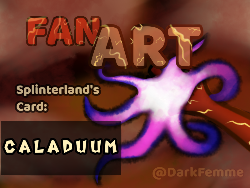
WITHOUT TURNOUT YOUR FLAME - NO APAGUES TU LLAMA / Splinterlands Art Contest Week 288 / (EN-ES)
1
About :
The inner fire is more important to demonstrate your strength than it seems at first glance.
Porque el fuego interno es más valioso por lo intenso que es, que por lo que aparenta.
Millions of people living in the world and each one with a unique way of seeing images, this very personalized vision is based on how we see life, the experiences we have had and miles of our own characteristics -but I don't have enough time to tell You all in this post hehehe
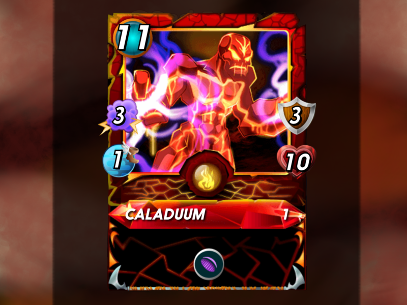
 For that reason I have chosen one of the Splinterland cards to show you the way I see it. And the chosen card is:
For that reason I have chosen one of the Splinterland cards to show you the way I see it. And the chosen card is:
Existen millones de personas en el mundo y cada una con una manera de ver las imágenes, está visión tan personalizada está basada en cómo vemos la vida, las experiencias que hemos tenido y miles de características propias que no tengo el tiempo suficiente para contar en este post.
Es así como he escogido una de las cartas de Splinterland para mostrarles la manera en que yo la veo. Y la carta escogida es:
Es así como he escogido una de las cartas de Splinterland para mostrarles la manera en que yo la veo. Y la carta escogida es:
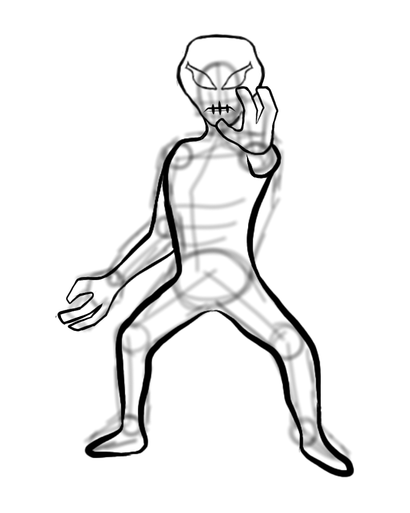
SKETCH
///
BORRADOR
SKETCH
///
BORRADOR
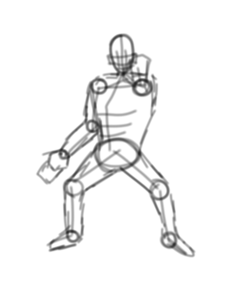
It has been very rewarding to work on that design and I think I should start by telling you that the first thing I had to coordinate was to put together the pose that I want the monster to have in my design. To do this, I used the baselines and the circles for the folds of the body.
En esta primera etapa de un gratificante proceso, debo iniciar armando la pose que quiero que tenga el monstruo en mi diseño. Para ello, fuí usando las líneas base y los círculos para los dobleces del cuerpo.

BASIC LINES
///
LÍNEAS BÁSICAS
BASIC LINES
///
LÍNEAS BÁSICAS
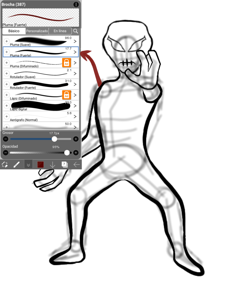
I traced the lines that would border each part of the body in the design, giving the drawing the peculiar features of the design more neatly. For that I used the "strong ink" brush.
Con el pincel "tinta fuerte", traseras líneas que bordearían cada parte del cuerpo en el diseño, dando al dibujo los rasgos peculiares del diseño con mayor prolijidad.
FILLED
///
RELLENO
FILLED
///
RELLENO
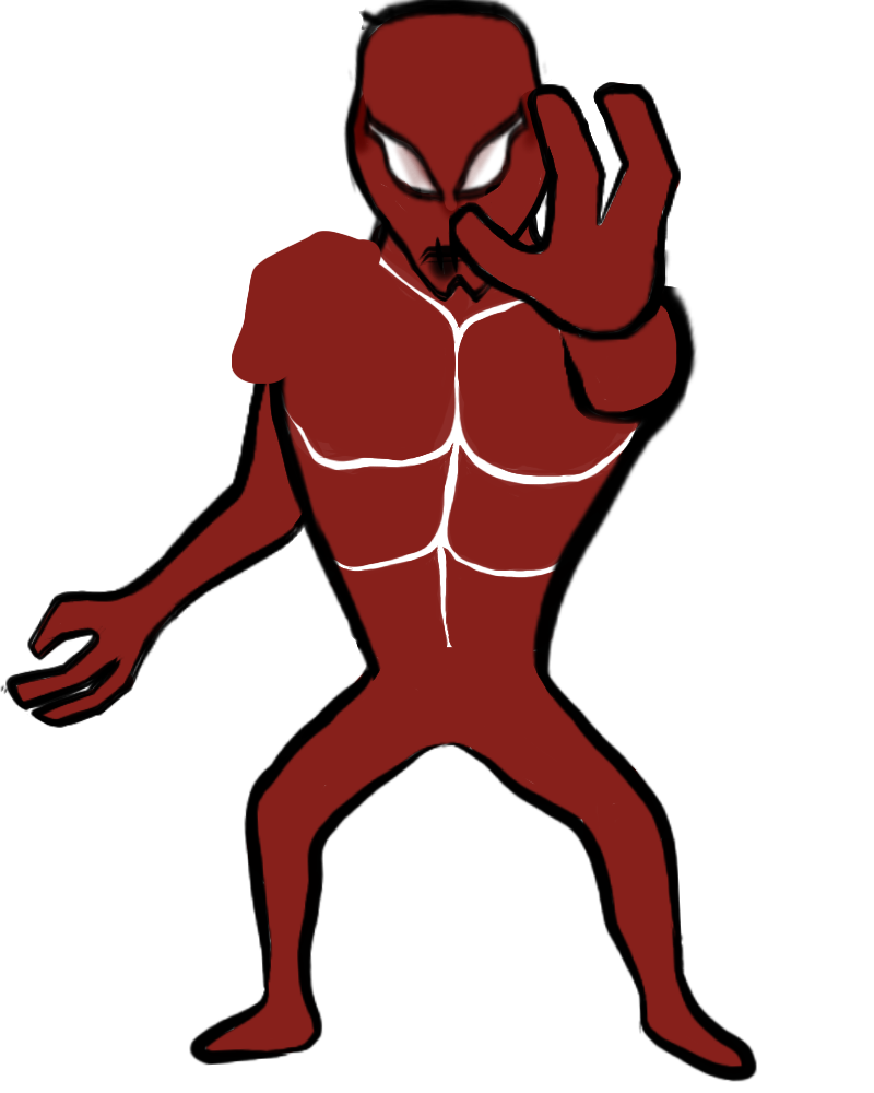
With the "marker" brush I filled the spaces within the lines with the same reddish color that the original image had, using that medium tone to lighten or darken it depending on the need that each section had.
Con el pincel "rotulador" rellené el diseño con el mismo color rojizo que poseía la imagen original, decidiendo utilizar este tono medio para poder aclararlo oscurecerlo depende de la necesidad que tuviera el diseño.

Also, I preferred to place each section of fill on a different layer so I could shade them independently, without it being so laborious to do this work and making them look like rocks.
Adicionalmente, preferí colocar cada sección de relleno en una capa diferente para poder sombrearlos independientemente, sin que fuera tan laborioso realizar este trabajo.
BACKGROUND
///
FONDO
BACKGROUND
///
FONDO
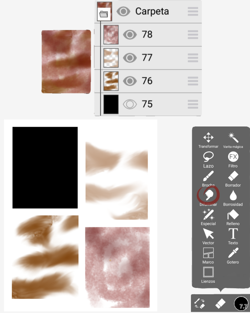
My first step was to take the "paint can" with the color black and apply it to an empty layer.
The theme of the monster is that it is composed of rock and lava, for this reason, the earth would be the perfect complement for background.
So I thought about making the background with those colors (brown, terracotta and beige) so that the drawing of the monster could stand out.
With the "watercolor" brush and using those three colors in different layers. Then with the "smudge" tool, I mixed one color a little with the other to obtain an earthy effect.
Lo primero que realicé fue tomar el "bote de pintura" con el color negro para trabajar sobre este.
Quise hacer el fondo con colores tierra para que pudiera resaltar el dibujo del monstruo, también porque la temática del dibujo base es que está compuesto de roca y lava, por tal motivo, la tierra sería el complemento perfecto para el fondo.
Para hacerlo primero tomé el pincel "acuarela", utilizando tres colores (marrón, terracota y beige). Luego con la herramienta "difuminar", fui mezclando un poco un color con el otro.
FINAL ART
///
ARTE DEFINITIVO
FINAL ART
///
ARTE DEFINITIVO
Additionally, to give a more polished touch to the drawing, I made several additional details such as painting the lava cracks yellow with the "strong ink" brush.
At the same time, I noticed that I had turned out quite reddish for the original color of the monster and I took the airbrush with an orange tone and applied it over the entire silhouette.
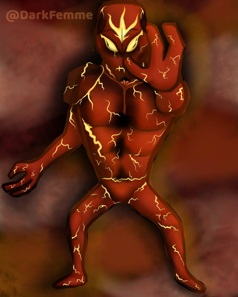
After working in some details, this is the final art:
At the same time, I noticed that I had turned out quite reddish for the original color of the monster and I took the airbrush with an orange tone and applied it over the entire silhouette.
After working in some details, this is the final art:
Adicionalmente para darle un toque más pulido al dibujo, realicé varios detalles adicionales como pintar de amarillo las grietas de lava con el pincel "tinta fuerte".
A su vez, noté que me había quedado bastante rojizo para el color original del monstruo y tomé el aerógrafo con un tono de naranja y lo apliqué sobre toda la silueta.
Ahora sí me siento satisfecha con el resultado y les muestro cómo quedó:
A su vez, noté que me había quedado bastante rojizo para el color original del monstruo y tomé el aerógrafo con un tono de naranja y lo apliqué sobre toda la silueta.
Ahora sí me siento satisfecha con el resultado y les muestro cómo quedó:
If you want to see what the design looks like when i include the power of this fiery monster...
Is your choice doing it or not XD
Tentacle of Power!
... you can watch the video 😉 hehehe
Is your choice doing it or not XD
Pero... Si quieren ver el diseño final con los
Allí está la imagen completa jijiji
Tentáculos de Poder
, podrán ver el vídeo 😉
Allí está la imagen completa jijiji
VIDEO TECHNICAL DETAILS /DETALLES TÉCNICOS DEL VIDEO
This video was maked by my INFINIX NOTE 11 PRO as a .MP4 file and edited with the free Capcut APP.
All images inside my video with digital art was created by APP Ibispaint.
The music was "90's Old School Bam Hip Hop" by CapCut's gallery.
All images inside my video with digital art was created by APP Ibispaint.
The music was "90's Old School Bam Hip Hop" by CapCut's gallery.
Este video fue editado con la APP gratuita de Capcut luego de ser creado con INFINIX NOTE 11 PRO.
Las imágenes dentro del video fueron trabajadas con la APP de ibispaint donde las realicé.
La música usada fue "90's Old School Bam Hip Hop" de la galería de CapCut.
Las imágenes dentro del video fueron trabajadas con la APP de ibispaint donde las realicé.
La música usada fue "90's Old School Bam Hip Hop" de la galería de CapCut.
Veremos si les gusta o no en los comentarios jijiji
 |  |  |
|---|---|---|
| On Twitter |
 & Telegram as @DarkFemme
Note:
All divisors, the video, the cover and sign was maked for myself with ibispaint and Capcut.
Original content will be posted in my social media for more promo.
Nota:Todos los separadores, el video, la portada y la firma son de mi autoría, realizados con ibispaint y capcut.
Contenido original que será publicado en varias redes con el mismo nombre de usuario para mayor promoción.
Show more
Tags :
Woo!
This creator can upvote comments using 3speak's stake today because they are a top performing creator!
Leave a quality comment relating to their content and you could receive an upvote
worth at least a dollar.
Their limit for today is $0!
Their limit for today is $0!
2 views
2 years ago
$

5 views
a month ago
$
23 views
4 years ago
$
3 views
3 years ago
$
12 views
6 months ago
$
More Videos
2 views
3 years ago
$
6 views
3 months ago
$
8 views
3 years ago
$

21 views
4 years ago
$
6 views
3 years ago
$
3 views
2 years ago
$
6 views
2 years ago
$
6 views
a year ago
$
6 views
5 months ago
$
3 views
3 years ago
$
4 views
8 months ago
$
27 views
a year ago
$
27 views
2 years ago
$
11 views
2 years ago
$

11 views
2 months ago
$
3 views
2 years ago
$
0 views
4 months ago
$
50 views
10 months ago
$
12 views
10 months ago
$

7 views
a year ago
$
14 views
a year ago
$
4 views
3 years ago
$
1 views
6 months ago
$
Comments:
Reply:
To comment on this video please connect a HIVE account to your profile: Connect HIVE Account