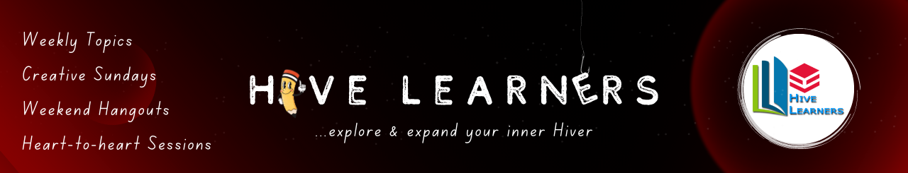
Hive Learners Banner Contest Entry
30
About :
The Hive Learners community just hit five thousand subscribers, and to commemorate that, there's a contest to make designs for the community banner. This is my entry with the entire steps to achieve my designs.
Video blah blah blah
The video is a more elaborate demonstration of everything I did to make the banner.
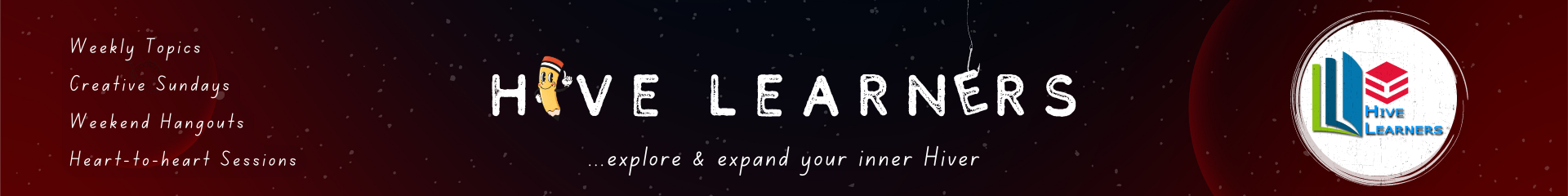
Making the background
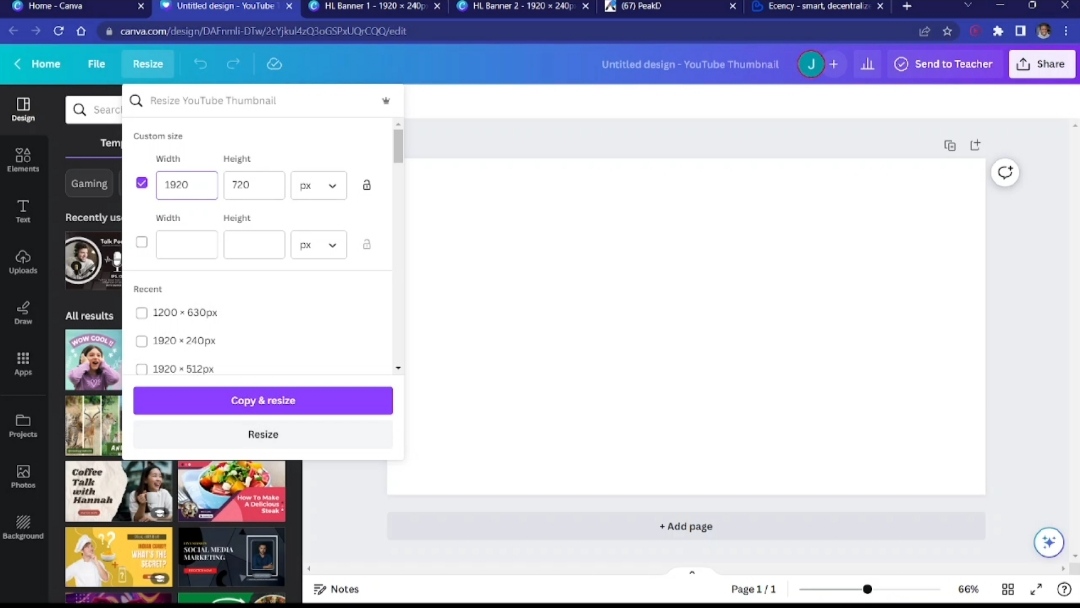
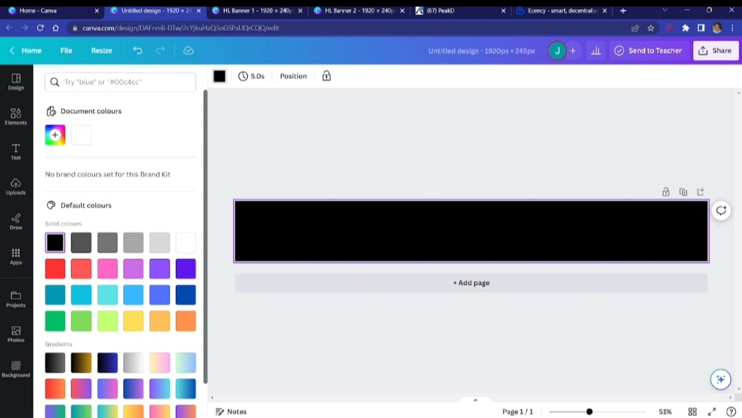
The required dimensions for the banner are 1920 x 245 px. Therefore, I started off by picking a default dimension of 1280 x 720 px and then resizing it to what was required, 1280 x 245 px. Next, I changed the colour of the background to black, as I was going for a space-like look.
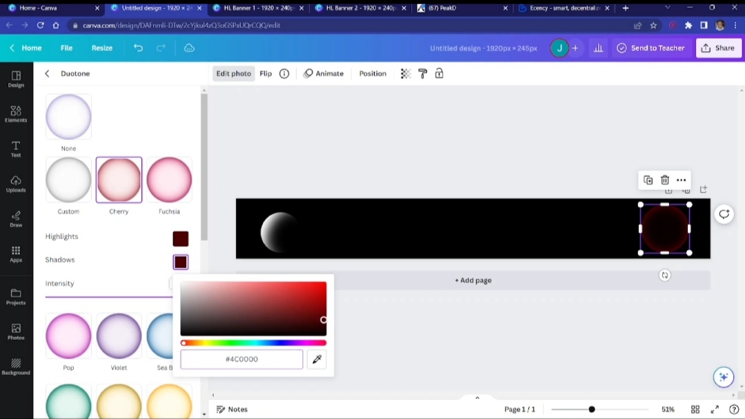
I then started to introduce some elements. I searched for "gradient circle" and picked two kinds that I needed for the design. I resized them as I desired and then changed their colour.
Changing the colour isn't always straightforward with some elements. These elements, the "gradient cirles," are one of them. What I do in this type of situation to change the colour is to use the "Duotone" effects. From there, changing the colour is possible.
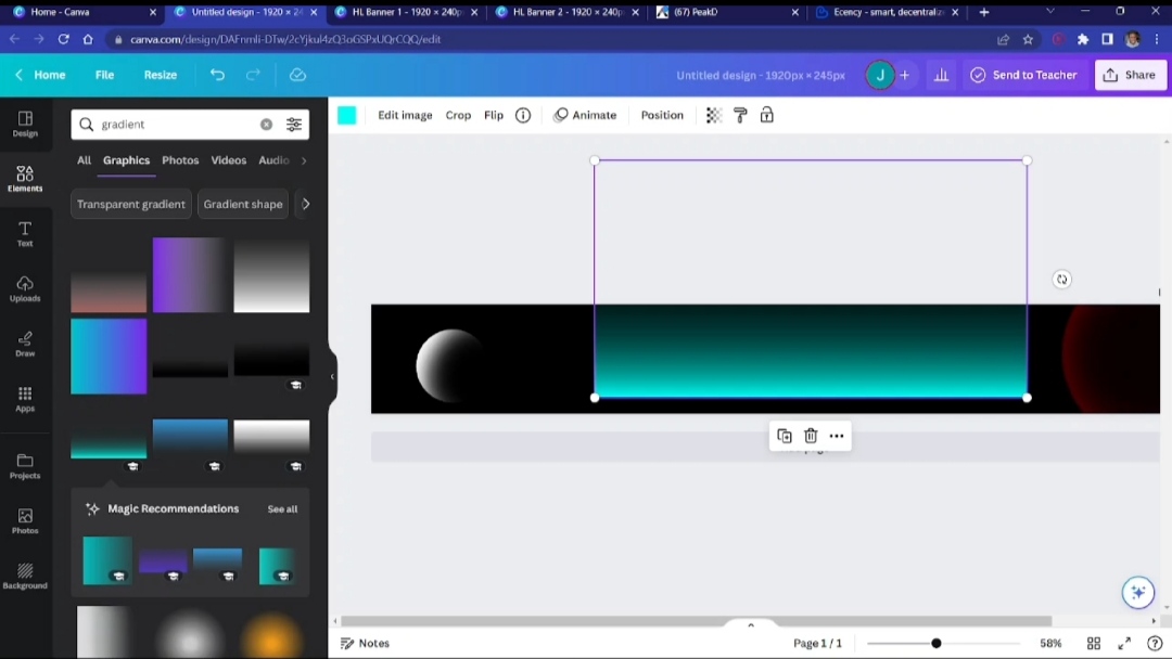
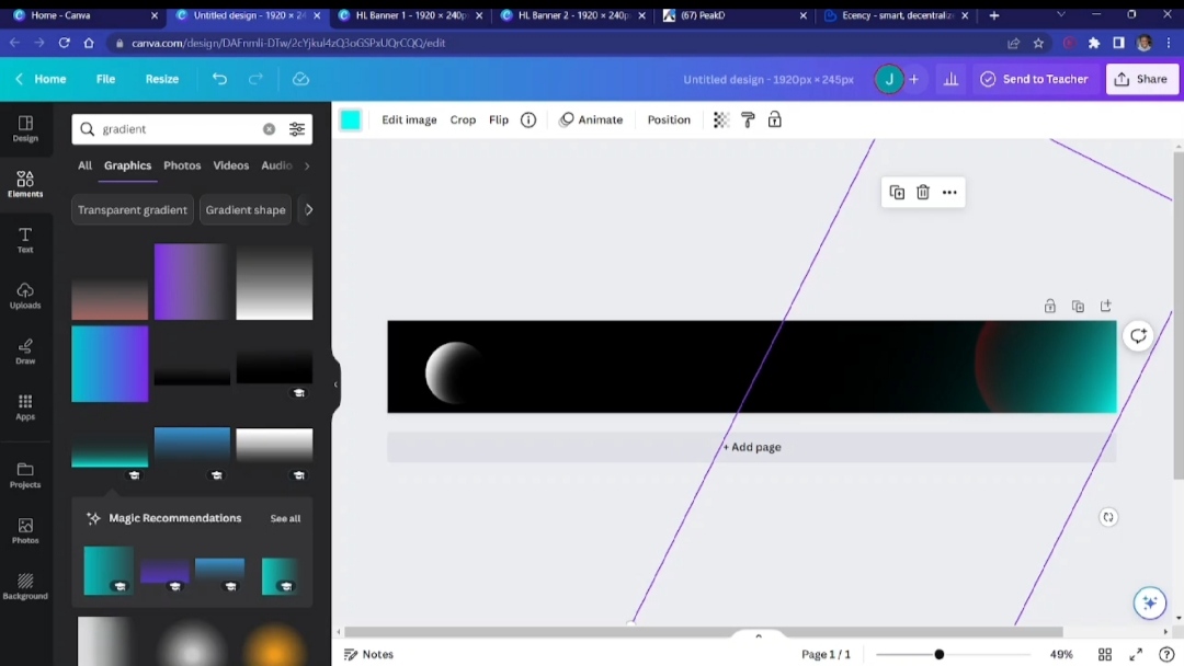
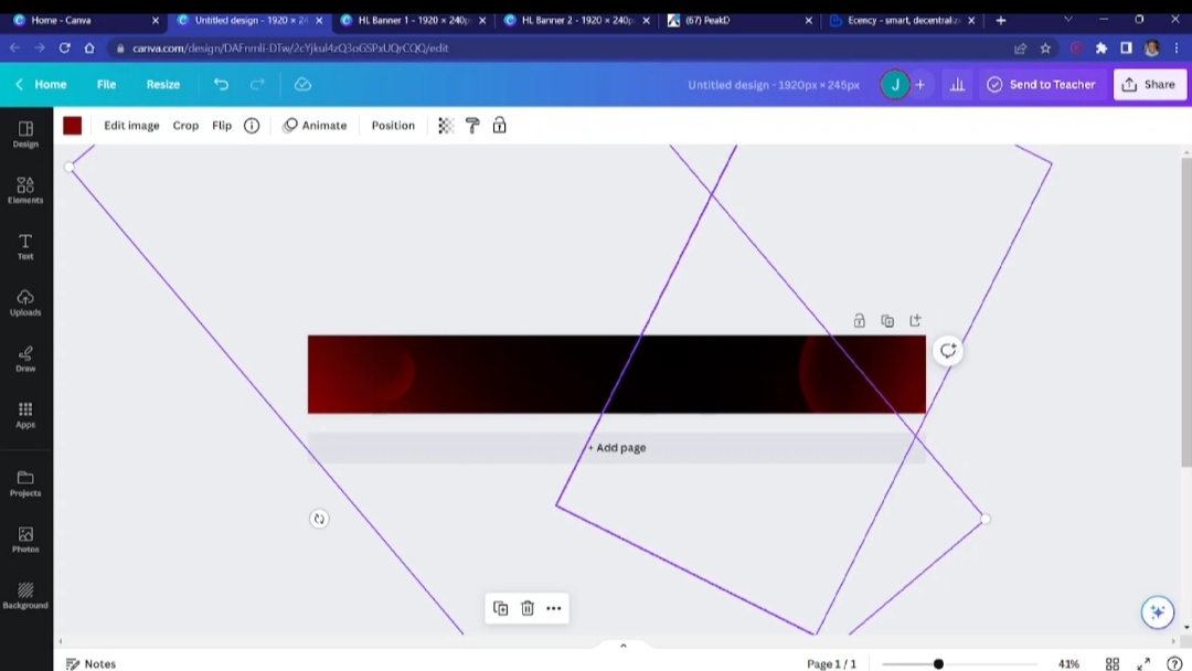
I needed the corners to have a lot more red, but in a smooth way. And so, I introduced another gradient element, but rectangular this time.
I then resized, changed the colour, and positioned it to achieve what I was looking for, making the corners a lot more red. At this point, this is the background I wanted to use to layer the rest of the elements.
Making the "Hive Learners" text
I could have just done this the regular way and just written the text, changed the font, and resized it, but I thought to spice it up a bit by adding some creative touches.
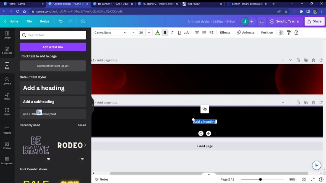
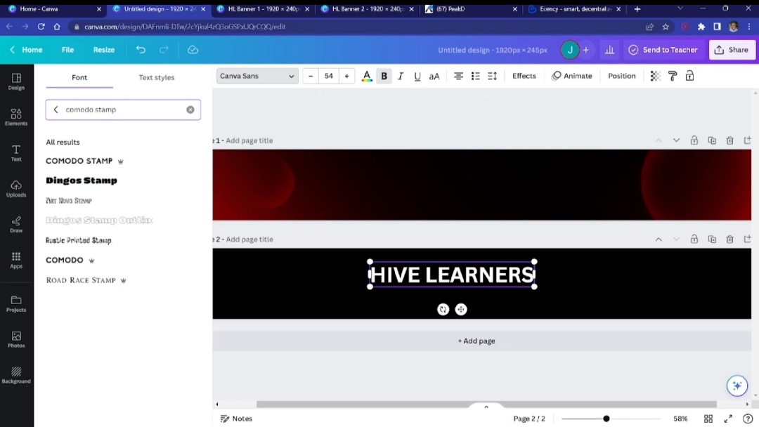
First off, I did the normal thing by introducing a text box. I wrote "Hive Learners" and adjusted it. I felt the COMODO STAMP font would suit my design as it wasn't too serious and also wasn't too casual, and so I used it.
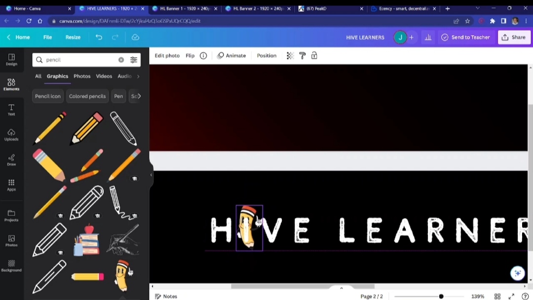
Now, here's where I try to be creative. I brought in a pencil from the elements tab and laid it over the letter "I."
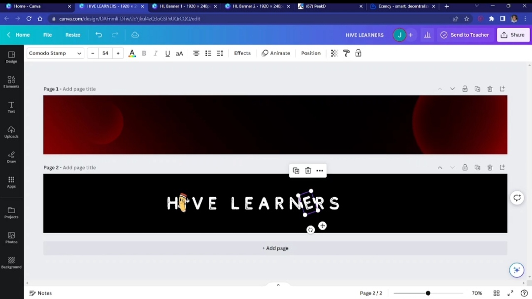
Nex, I took away the letter "E" from the entire text and replaced it with a space. I introduced the new letter "E" and rotated it a bit.
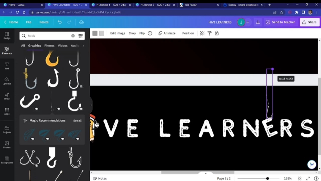
Afterwards, I brought in a "hook" element and lined it up with the rotated letter "E." That would give it a dangling kind of look.
Describing the community
I thought to make the banner speak about the community and what it is about in the most effective way, so I thought of the caption sub-title, "...explore & expand your inner Hiver." Because, well, that's what we do here in the Hive Learners community; we keep trying to grow as the community itself helps us to.
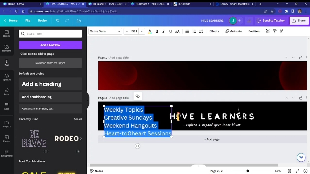
Next, I thought to include what we do regularly. There are weekly topics, creative Sundays, weekend hangouts, and our beloved Heart-to-heart sessions on Mondays at 4 PM UTC (link). I put them on the left side of the banner, selected my desired font (Canva Student Font), and adjusted their spacing.
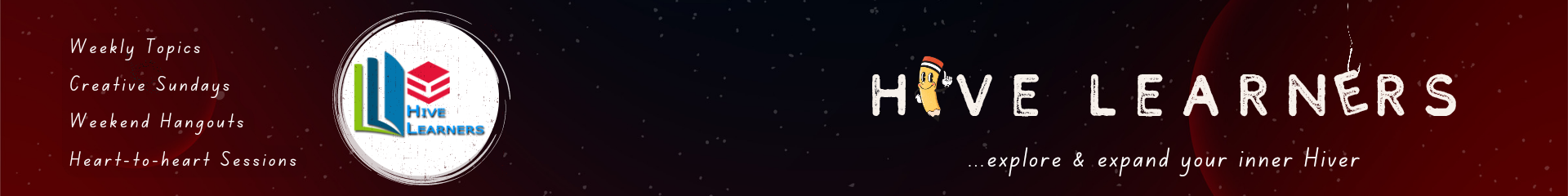
Redesigning the logo
Okay. The logo is great, and I love it, but with the colours it has, I felt it wasn't going to pop on the dark background I made. And so I thought to implement something that would show its beauty.
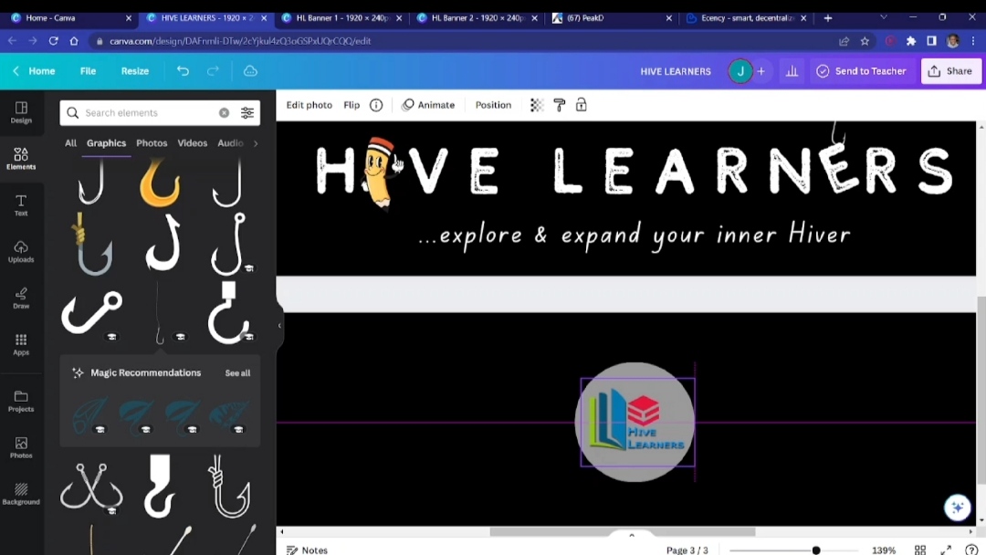
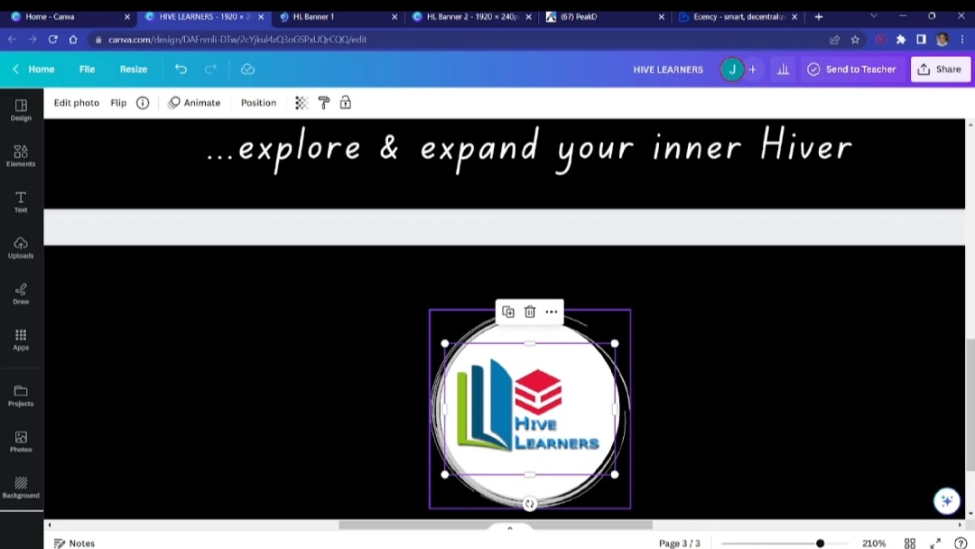
I introduced a circle and put the logo in the middle of it. And, then, for aesthetics, I added some fancy hollow circles to spice it up. I put it around the circle where the logo was and made it concentric. I joined them together to make a group to allow easy transpositions, and I placed them on the final design. And, also, I added some stars to the background.
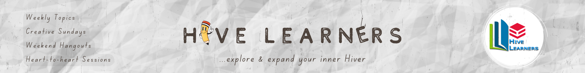
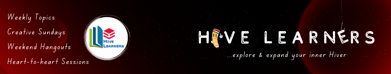
Making variations
I wasn't exactly sure what would appeal to everyone. And, also factoring in the fact that (especially on peakd) banners appear differently on different devices—PC, mobile, and the like—I decided to make up some spins to see what works.
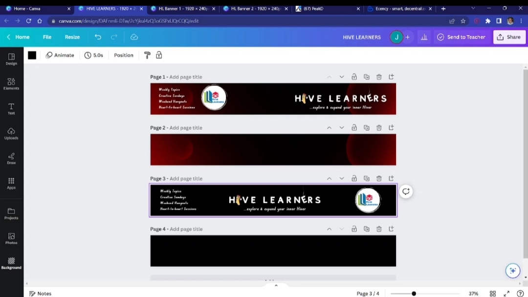
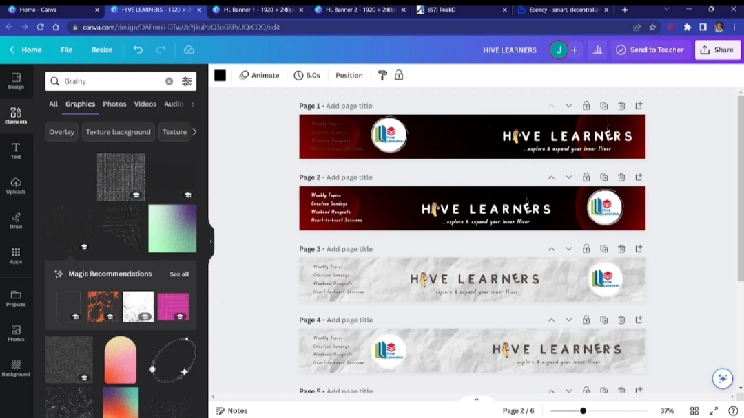
All I did was rearrange the elements to give it a different look, which will hopefully look nice. And, for experimentation, I tried a completely different background and changed a few other things.
Whatever the community leaders consider, if they like my work, they can have varieties from me to choose from.
Finally
But I realised in the end that I was working on 1920 x 245 px instead, so I resized it to 1280 x 245 px after everything. And here we go...
Again, the processes are more elaborate in the video up above. I made the designs and recorded the entire thing to show exactly what I did. Thank you for reading/watching!
Show more
Tags :
Woo!
This creator can upvote comments using 3speak's stake today because they are a top performing creator!
Leave a quality comment relating to their content and you could receive an upvote
worth at least a dollar.
Their limit for today is $0!
Their limit for today is $0!
15 views
a year ago
$
51 views
8 months ago
$

41 views
8 months ago
$

42 views
7 months ago
$

42 views
a year ago
$
More Videos

4 views
a year ago
$
15 views
4 months ago
$
4 views
a year ago
$
27 views
11 months ago
$
6 views
3 years ago
$

14 views
3 years ago
$
28 views
2 months ago
$
27 views
11 months ago
$
45 views
a year ago
$
7 views
a year ago
$

5 views
a year ago
$

11 views
a year ago
$
2 views
a year ago
$
28 views
a month ago
$
2 views
4 years ago
$
7 views
2 years ago
$
14 views
2 years ago
$
31 views
6 months ago
$

2 views
2 years ago
$
20 views
a year ago
$
8 views
2 years ago
$
3 views
2 years ago
$
Comments:
Reply:
To comment on this video please connect a HIVE account to your profile: Connect HIVE Account